.png)
Weaving story telling principles into reporting visuals and dashboard design. A systematic practical UX/UI approach to addressing enterprise dashboard design, ensuring dashboards bring value to the business to prioritize actionable insights.
%20(1).png)
In this project, creating an effective Power BI dashboard involves not only organizing and presenting data in a visually appealing manner but also ensuring the dashboard is intuitive to use, responsive across various devices, and customizable to suit the specific needs of the users. Elements such as color schemes, data visualization techniques, interactive features, and clear navigation play a crucial role in enhancing the usability and user experience of the BI dashboard. Moreover, I made a component that is used for every status of diagrams in responsiveness mode. Besides I should illustrate Drill tools(Drillup, Drilldown, Drill Thought), Shimmer loading, and show value.
Discover
The primary audience for this project consisted of organizational managers who required access to essential reports presented in the form of chartary capabilities within the system framework. It was essential for me to focus on responsiveness across all devices, including desktops, tablets, and mobile.
(1).png)
The proposed solution is a diagram component that includes common features such as Zoom, Drill Down, Drill Up, Sort, Details, etc. Additionally, I divided these features into two parts. The first part should be more accessible than the second one; therefore, they are embedded as an icon buttons, while the others are organized in a menu.
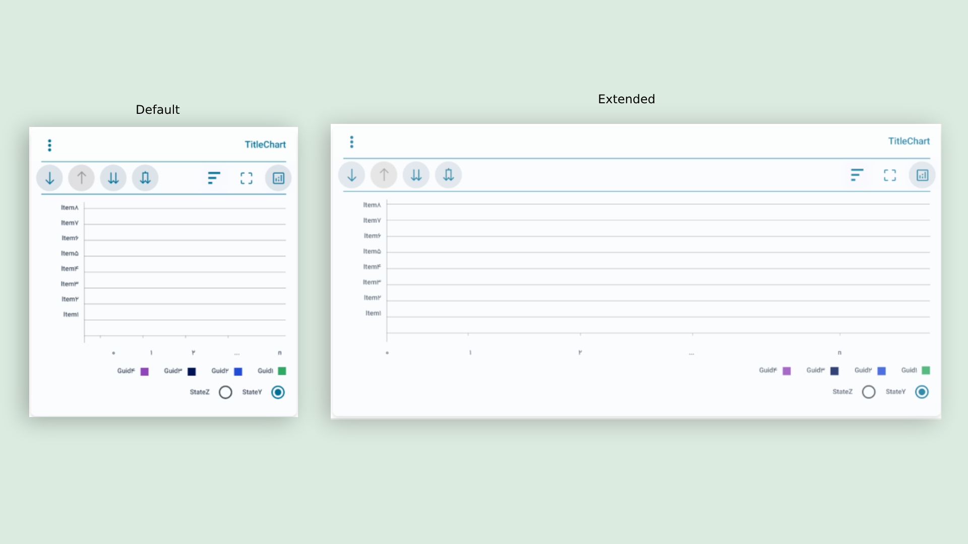
From a technical perspective, this component encompasses all types of diagrams, including pie, bar, line, and more. Additionally, I have focused on implementing filters for convenient reporting. These filters should limit the reports based on date, organization, and city. To achieve this, I utilized a tree view method, particularly for the date filter, as it also includes seasonal items.

(1).png)
.png)